
Catona Brand
Catona Brand
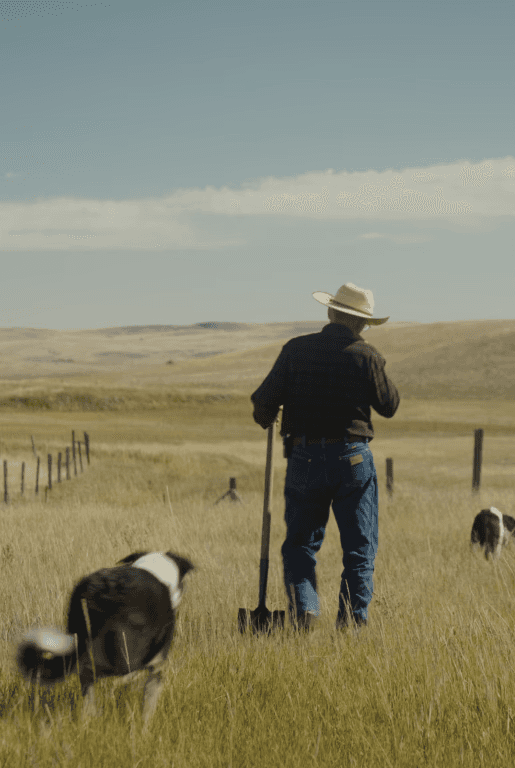
Catona is a climate finance platform that channels catalytic capital into high-impact carbon projects. Built to reshape the relationship between investors, land stewards, and project developers, the brand helps de-risk climate initiatives, signal market demand, and position finance as a force of nature.
Inspired by regenerative systems, the visual identity leans into design elements that reflect restoration, partnership, and transparency. The Catona symbol, formed from three leaves and a stock chart, embodies its core pillars.
Type and color choices flex between grounded and scientific, adapting to both financial and environmental contexts. Custom 3D illustrations and story-driven photography reinforce Catona’s commitment to clarity and connection—making climate finance feel
not only credible, but also beautiful and human.
From investor decks to field partner gear, the brand system moves fluidly across mediums, supporting a platform built on clarity, empathy, and tangible impact.
Catona
2024
Roles
Visual Identity
Art Direction
UX Design
Photography
3D Illustration
Motion Design
Credits
Chief Brand Officer: Danny Duran
Chief Marketing Officer: Greg Shadwick
VP Marketing: Angelica Lomeli
Copy: Pascal Zamprelli
Website Design: Brandee Busch
Systems Design: Brandee Busch

Logotype
Logotype
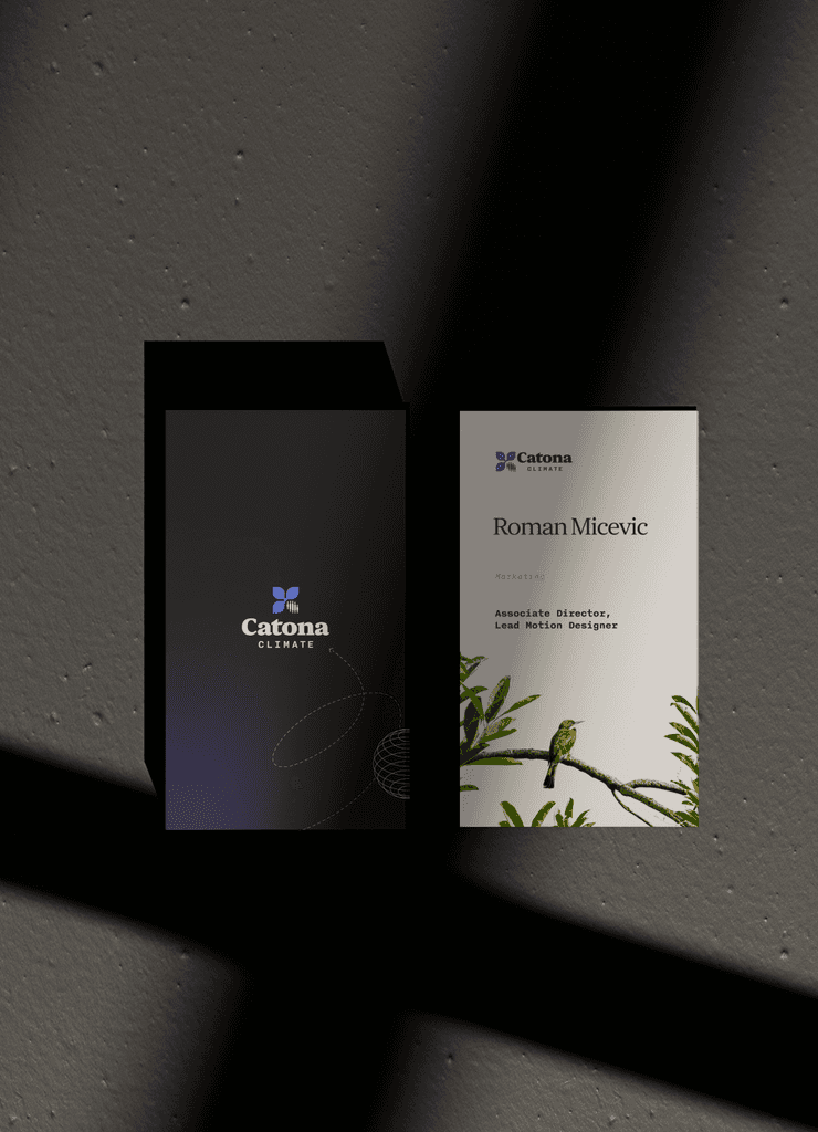
The Catona logotype was designed to embody the brand’s ambition to connect capital to nature; its very name a portmanteau that signals this mission. Set in Orbikular Heavy with a modified leaf on the stem of the “t,” the mark pairs weight and warmth, while “Climate” in Nittie brings contrast and editorial clarity. The icon distills the brand’s mission into three abstract leaves, representing the company’s 3 customers: developers, investors, and offset buyers. It works as a standalone or in flexible lockups, adapting across mediums. Reduction is also intentionally built into the symbol: what would be a lower right leaf is removed, signaling the carbon removals and reduction projects at the core of Catona’s offering. The result is a brand mark that is not only bold and credible, but made to be as scalable and nimble as the company it represents.
The Catona logotype was designed to embody the brand’s ambition to connect capital to nature; its very name a portmanteau that signals this mission. Set in Orbikular Heavy with a modified leaf on the stem of the “t,” the mark pairs weight and warmth, while “Climate” in Nittie brings contrast and editorial clarity. The icon distills the brand’s mission into three abstract leaves, representing the company’s 3 customers: developers, investors, and offset buyers. It works as a standalone or in flexible lockups, adapting across mediums. Reduction is also intentionally built into the symbol: what would be a lower right leaf is removed, signaling the carbon removals and reduction projects at the core of Catona’s offering. The result is a brand mark that is not only bold and credible, but made to be as scalable and nimble as the company it represents.


Colors
Colors
Developed to balance science, finance, and storytelling, Catona’s color palette blends rich purples, soft neutrals, and high-contrast tones to convey clarity and trust. Jewel gradients add warmth and energy, while semantic colors support technical charts and financial mechanisms in complex data environments. The palette flexes across decks, web, and education—anchoring the brand in both project storytelling and scientific rigor.


Typography
Typography
Catona’s type system combines Orbikular for expressive headlines, Nitti for scientific labels, and Nitti Grotesk for clear, versatile body copy. Orbikular lends institutional credibility with a soft, modern edge, while Nitti Grotesk—described by its foundry as “uncompromisingly modern and unpretentious”—grounds the brand in clarity. Together, they strike a balance between authority and approachability across
technical and narrative content.
Catona’s type system combines Orbikular for expressive headlines, Nitti for scientific labels, and Nitti Grotesk for clear, versatile body copy. Orbikular lends institutional credibility with a soft, modern edge, while Nitti Grotesk—described by its foundry as “uncompromisingly modern and unpretentious”—grounds the brand in clarity. Together, they strike a balance between authority and approachability across technical and narrative content.
Catona’s type system combines Orbikular for expressive headlines, Nitti for scientific labels, and Nitti Grotesk for clear, versatile body copy. Orbikular lends institutional credibility with a soft, modern edge, while Nitti Grotesk—described by its foundry as “uncompromisingly modern and unpretentious”—grounds the brand in clarity. Together, they strike a balance between authority and approachability across technical and narrative content.


Brand Film
Brand Film
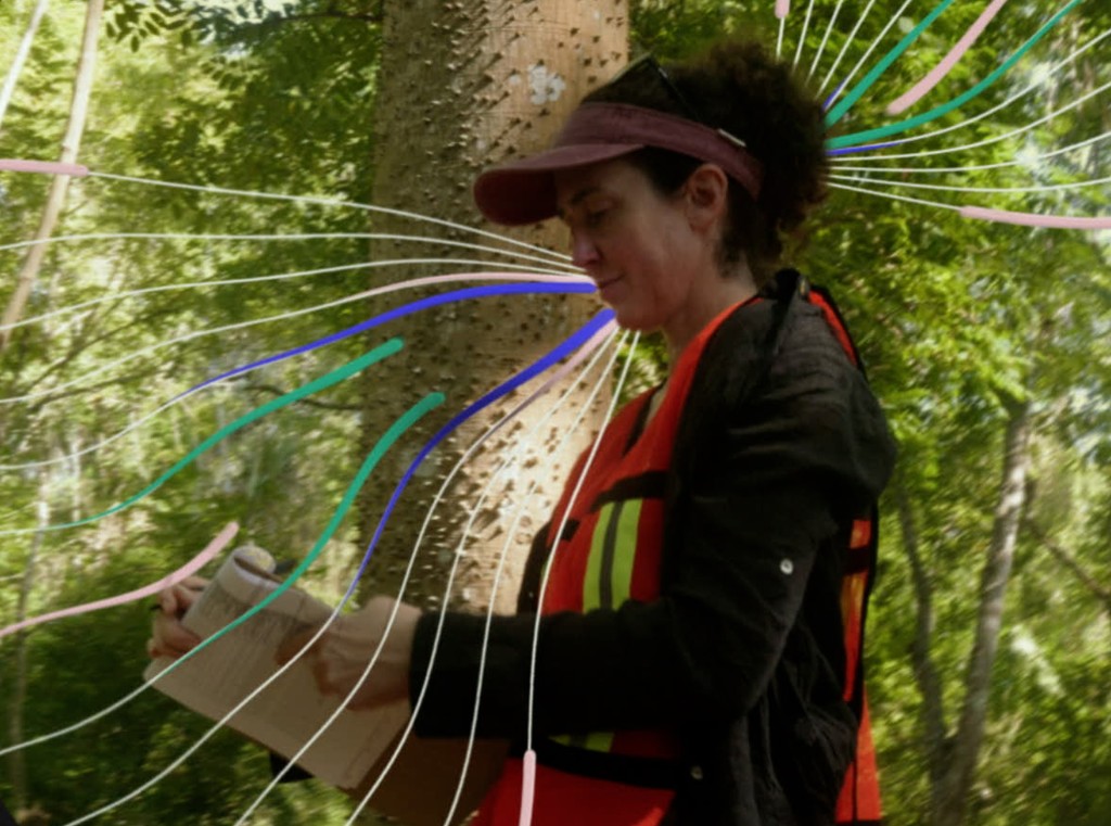
The Catona brand film was created to introduce the platform’s mission and model with clarity and urgency, premiering at COP29 to an audience of global climate leaders. Designed to distill the complexity of carbon markets, the film offers a grounded narrative that connects abstract systems to a simple, elegant solution: aligning capital with nature through Catona’s three-pillar model. Stylized 3D illustrations serve as wayfinding tools, visually guiding the viewer through Catona’s ecosystem of project developers, carbon purchasers, and investors. The result is a film that feels both technical and human—making the invisible infrastructure of climate finance feel tangible and hopeful.
The Catona brand film was created to introduce the platform’s mission and model with clarity and urgency, premiering at COP29 to an audience of global climate leaders. Designed to distill the complexity of carbon markets, the film offers a grounded narrative that connects abstract systems to a simple, elegant solution: aligning capital with nature through Catona’s three-pillar model. Stylized 3D illustrations serve as wayfinding tools, visually guiding the viewer through Catona’s ecosystem of project developers, carbon purchasers, and investors. The result is a film that feels both technical and human—making the invisible infrastructure of climate finance feel tangible and hopeful.


Website
Website
Catona.com was developed in partnership with Instrument to bring the brand’s mission to life online—combining clarity, usability, and trust. Built on a modular component system, the site allows users to explore complex content through expandable cards and a dynamic structure that scales with the platform. A custom CMS powers the Resources hub, enabling real-time updates to frameworks, methodologies, and research. By making Catona’s process transparent and accessible, the site builds trust in the carbon market—earning it a 2024 Webby nomination for Corporate Responsibility.
Catona.com was developed in partnership with Instrument to bring the brand’s mission to life online—combining clarity, usability, and trust. Built on a modular component system, the site allows users to explore complex content through expandable cards and a dynamic structure that scales with the platform. A custom CMS powers the Resources hub, enabling real-time updates to frameworks, methodologies, and research. By making Catona’s process transparent and accessible, the site builds trust in the carbon market—earning it a 2024 Webby nomination for Corporate Responsibility.


To work together or for more information,
get in touch at RomanMicevic@gmail.com
See Instagram
Roman Micevic is a multidisciplinary designer and art
director specializing in motion design, video editing, and
visual storytelling for mission-driven organizations.
To work together or for more information,
get in touch at RomanMicevic@gmail.com
See Instagram
Roman Micevic is a multidisciplinary designer and art director specializing in motion design, video editing, and visual storytelling for mission-driven organizations.
To work together or for more information,
get in touch at RomanMicevic@gmail.com
See Instagram
Roman Micevic is a multidisciplinary designer and art
director specializing in motion design, video editing, and
visual storytelling for mission-driven organizations.